the design for the info centre is based on three main themes
dealing with the physical existing building:
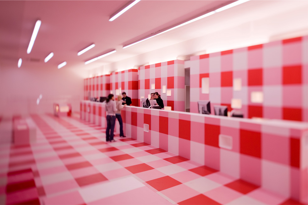
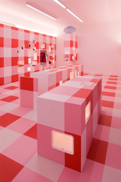
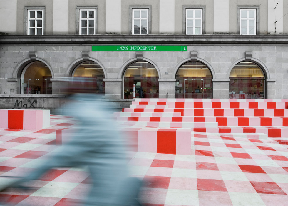
in front of the actual façade was a massive stone wall, closed towards the main square, which acted as a barrier against visitors; a timber structure of stairs and seating steps placed in front – with no railings or similar distracting additions – levels out this barrier, inviting visitors to step onto the artificial landscape or linger on it. the material of the landscape penetrates the thermal façade (the original small-scale shopfront glazing was replaced with glass elements as large and frameless as possible) and also forms something like a landscape inside (desks, presentation surfaces…) – a unity of interior and exterior. bright lighting of the interior makes the actual façade recede even further. the main square penetrates the info area, and the info area runs out towards the main square.
the pattern:
linz is provincial (it rhymes in german and has often been used) – and it is true. it is particularly bad when, from this position, attempts are made to appear especially urban or “styled”. our answer should be understood as a tongue-in-cheek reference to regionality – and of course as a hospitable gesture: the checked tablecloth as a symbol of hospitality. and nothing more than this oversized tablecloth should appear – no information through large signs, flags or lettering on the façade; the infopoint should explain itself…